Role
Senior Product Designer
Responsibilities
Gravity Sketch — XR/AI novel interactions
Led a UX audit that shaped three major releases: Colors & Materials, Environments, and AI for XR for Gravity Sketch, a 3D creative tool backed by Accel and GV, used by Ford, Nike, and New Balance.

Design debt due to scaling fast
As Gravity Sketch scaled rapidly, features were added organically, leading to a disconnected and inconsistent user experience.
Features added fast
No coherent structure
Top tools buried 3–4 interactions deep
Users couldn't discover certain features
My role
I led a comprehensive UX audit that mapped every interaction, trigger, and entry point in the app, then used those findings to design and ship feature releases: Colors & Materials, Environments Panel, and AI for XR.

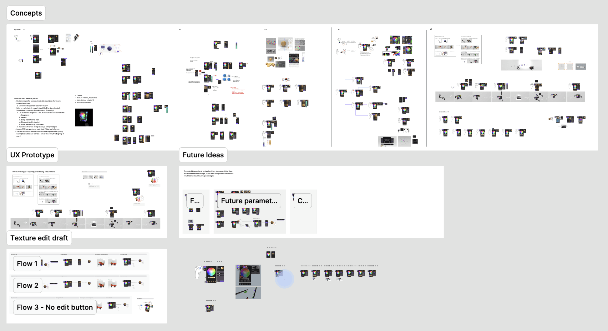
UX Audit
I mapped the whole app and ran VR workshops with power users to test the findings in-product. The design team helped validate. Every release after had to answer one question: where does this sit, and can users find it?

What it revealed
Core creative tools buried hidden in the 3rd and 4th proximity circle
Inconsistent icons adding cognitive load and lack of branding
Lack of standardizing for controller patterns (equivalent to keyboard shortcuts)
No AI integration strategy

PHASE 1 — VISUALIZATION CONTROLS
Ford, Nike, and New Balance needed better visualization controls in VR.
We scoped the work as two connected sprints and releases: Colors & Materials and Environments & Lighting
Both with the same root goal to give creative teams the visual fidelity to make real decisions without leaving the tool.
Colors & Materials
Existing challenges:
Editing materials required holding two-three controller buttons simultaneously while a floating panel — breaking flow state every time
No way to manipulate textures or save custom materials

Through user feedback and workshops, I identified gaps in the entry point and the need for swatches and a materials library.
Shipped
New entry point fixed the panel opening across objects in space
Advanced features hidden from new users to simplify onboarding
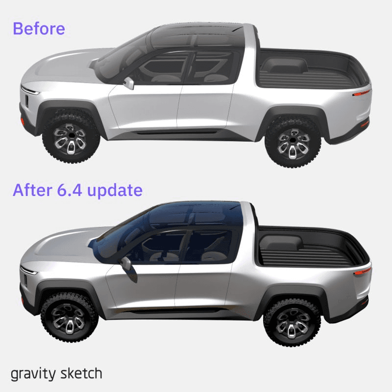
Off-hand trigger pattern as a precision modifier (10% steps) and direct texture editing through headset controls instead of sliders
Custom material library tailored to how creative teams actually work
Environment & Lighting
The existing environment library was underpowered and hard to find. The audit confirmed it was buried deep, most users didn't know it existed.
Shipped
Redesigned as an environment library aligned visually with the materials library UI, with improved discoverability.
Added new controls giving users direct manipulation over their scene environment — lighting, context, staging — where previously options were limited and preset-only.
Doubled-down on existing patterns like 'grab + edit' to build mental models and speed up the learning curve of the tool.
IMPACT
+5.3% growth — reversed aggressive post-holiday churn from negative to positive by March
Overall increase in feature usage — +5.8% for Lighting & Environment new entry point 2 quarters after release
Scalable visual design system — optimised, on-brand, ready for future releases
Community validation — positive feedback across social channels


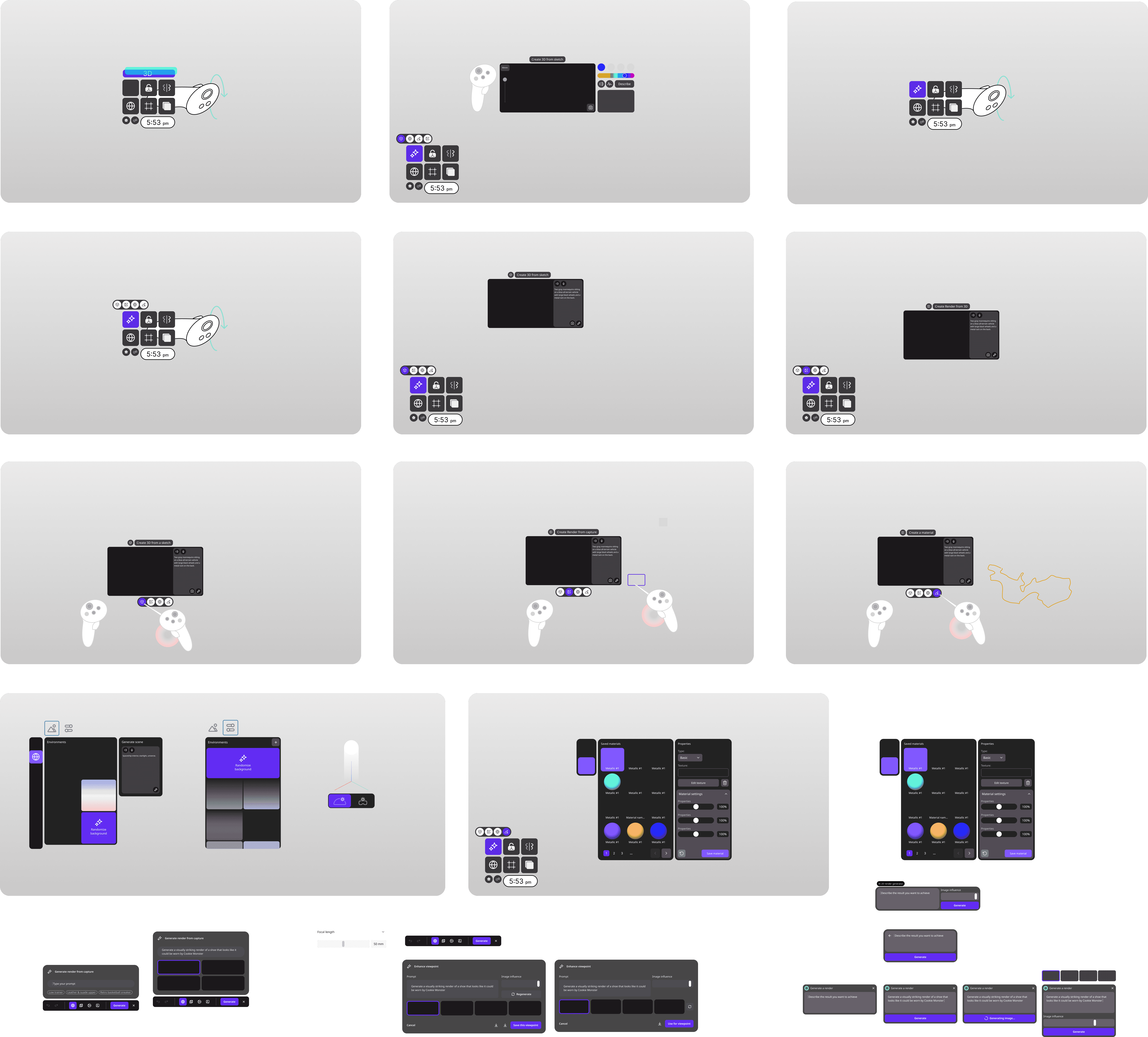
PHASE 2 — NOVEL INTERACTIONS (AI for XR)
I ran sessions with power users to understand what AI should actually do in a spatial environment. They didn't want AI to design for them, they wanted it to accelerate their own thinking.
Get started modelling easily
img > 3D (base shapes out of sketches)
Better communication of ideas with less effort
img > img (similar to vizcom)
Easily set up environments, add textures
prompt > img (output are .hdr and .pbr)
Better
Tests & explorations:
The constraint we didn't expect
When we presented our AI explorations to customers, corporate AI policies prevented their teams from testing generative creation tools.
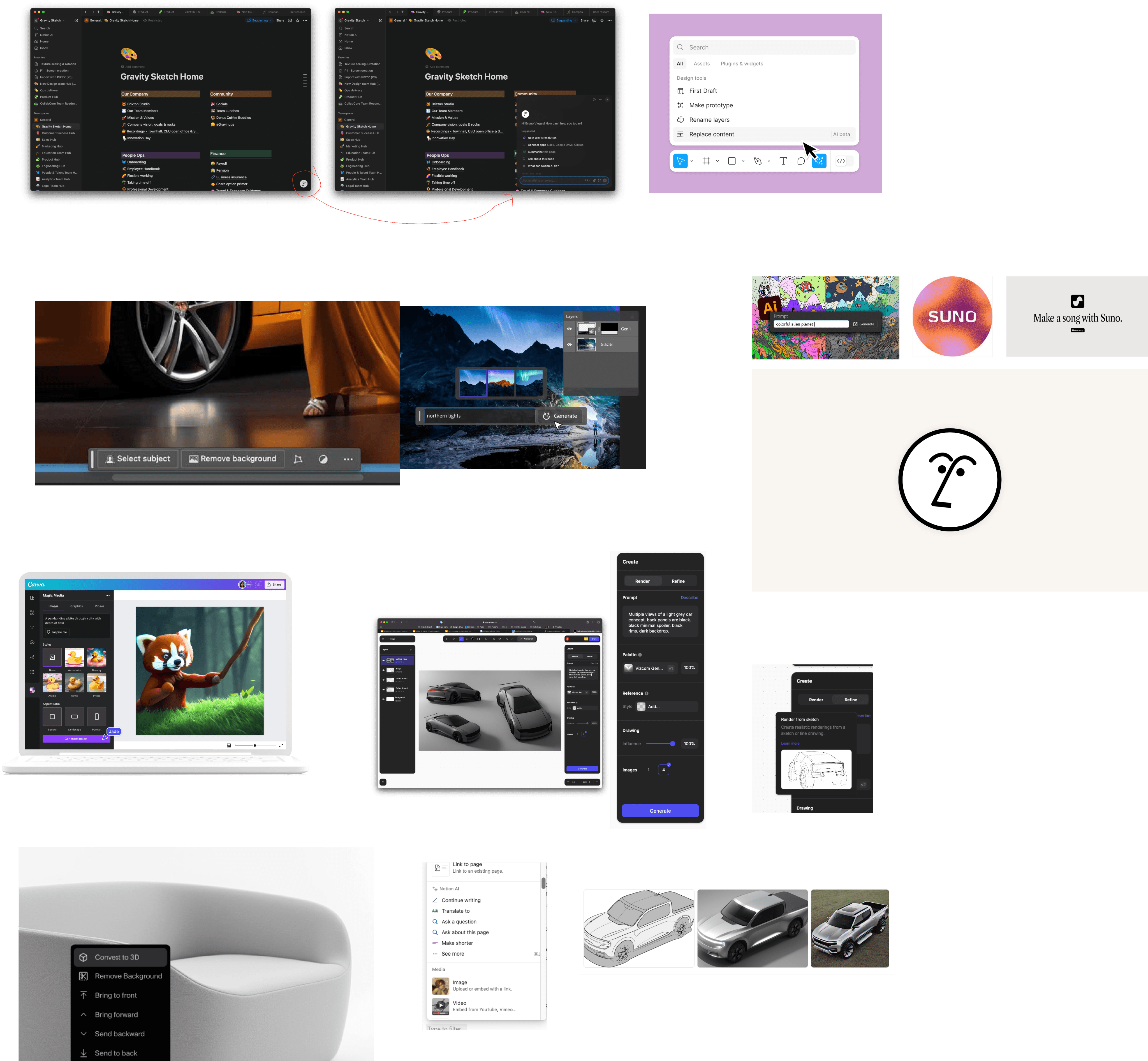
Instead of abandoning the vision, we moved towards a ship-to-learn strategy: beta test features with community users for image-to-3D, and a Vizcom browser integration that leveraged tools enterprise clients already had approved access to.
Shipped
1. Image to 3D — users add a reference image, generate a base mesh, import it to their scene, and sketch on top. Built on AWS's generative model. Released to community beta.
2. Integrate existing AI tools — rather than building a rendering pipeline in-house, we integrated Vizcom inside Gravity Sketch's VR browser. Enterprise designers with existing Vizcom access can now use it spatially.
Learnings & Vision
Built with the CEO, this map defines the interaction model we're working toward:
Voice input replacing the VR keyboard
Vertical-specific LLMs for automotive and footwear
AI-integrated features for materials & environments creation